Welcome back to the Brawl, my friends!
Last week, North America and Europe duked it out over Weaponlord on the Super NES, with NA giving their EU PALs a good wholloping and taking home 85% of the vote.
Today, we’re looking back at Rare’s Blast Corps, a delightful piece of nonsense from Twycross’ 64-bit masters which saw you destroying everything in the path of a trundling warhead to prevent a catastrophic explosion. What can we say? Bananza’s got us in the mood for smashing stuff to smithereens.
It’s a duel this week, as the European version was just the NA version with the customary black border. After checking out the options, drop your vote in the poll at the bottom of the page and we’ll see whether East or West is best when it comes to the ol’ smashy-smashy.
Let’s get blasting.
North America
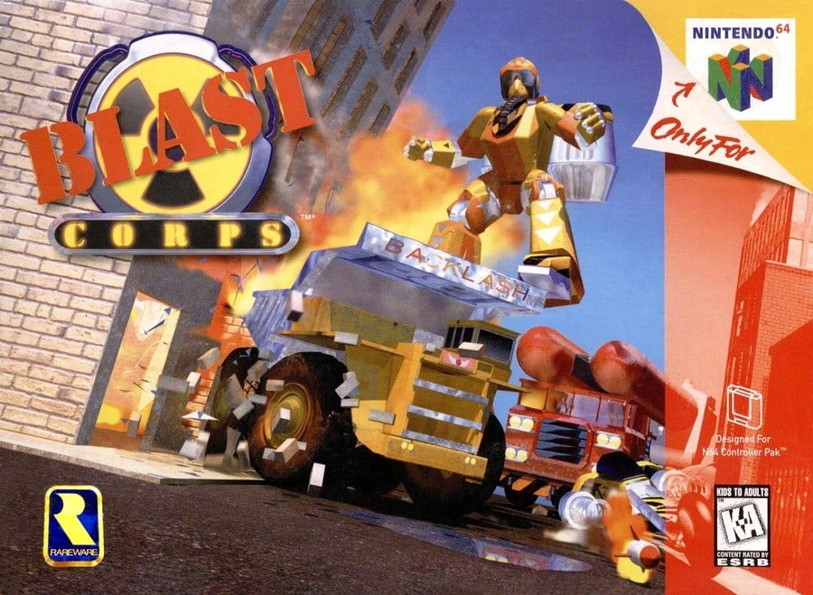
The Western variant. shows J-Bomb standing atop Backlash with the bike (Ballista) in the bottom right corner, behind which the big red bomb-laden carrier is seen approaching.
The puddle at the bottom, the flying bricks, and the fiery billows from the collapsing building offer some visual interest and help distract from the blocky nature of the render. The logo in the top right feels a bit generic and the red stencilled ‘BLAST’ gets a bit lost on top of the radiation symbol, but despite being a bit disparate, we can’t help up like this.
Japan
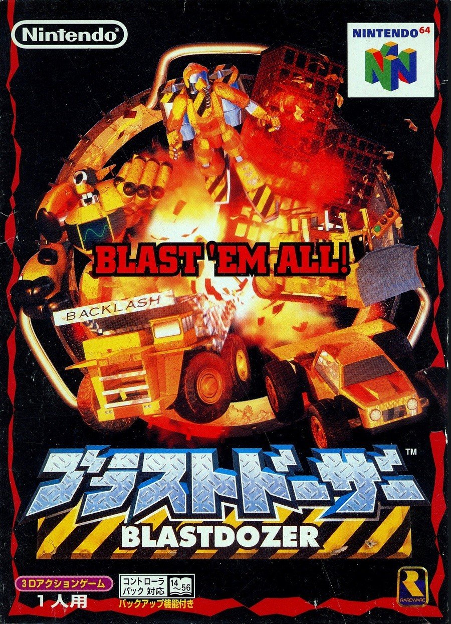
Whether you prefer the Japanese or North American cover, we can all agree that Blastdozer is just a better name, if only because there’s zero confusion over the pronunciation and you’re unlikely to provoke laughs in the playground when you tell your pals that Blast ‘Corpse’ looks amazing, instigating months of merciless ribbing.
Ahem. Looking at the cover, there’s a lot to love. Cool mechs and big vehicles? Check. Explosions? Natch. Big red slogan slapped right over the centre? Boom. In honesty, ‘BLAST ‘EM ALL!’ isn’t the most riveting line, but we admire the bombast of putting it right in the centre of the blast, exactly where a less confident game would slap the logo.
And that logo at the bottom is a winner, too, boldly mixing the blue-tinged steel plating with the yellow and black warning barrier behind. We’re not quite sure that that red, ticker-tape thing around the border is supposed to be, but we think we like it.
Thanks for voting! Remember that this one is part of the Switch Online Expansion Pack library, so if you missed it back in *checks notes*…1997…*has a moment*, you can easily catch up with this winner.
Otherwise, we’ll see you next time for another Box Art Brawl.
